Arise!

October 16, 2009

Over a year after my last post! Yikes. I’m going to try to update at least once a week and see how it goes.

This first one is just to plug some illos I did last month for a Paul Krugman piece in the NYT Sunday Magazine. It was a great call to get, and has led to some new contacts, but it did consume all two weeks of my summer vacation.

krugman_spread1

Click on the above draft image to see the article online. It’s great to be archived like that, but the drawings looked sooooo much better in print that it’s hard not to cringe at their digital counterparts.

Hi, Mom!

August 23, 2008

I never imagined this would happen, but I guess it’s old news that everything is on YouTube these days. You kids with your digital video!

Berlin ist Hier

August 21, 2008

Fed Ex dropped of my copies of City of Smoke today. Clem appears delighted, but it may just be the off-gassing of industrial Chinese printing ink that’s making her smile like that. I’m not as excited as I should be, for some reason. There it is, seven years of my life in 196 pages of story. What is that, like 28 pages a year? Oh yeah, maybe that’s why I’m depressed.

Anyway, here’s to getting the next one done in four!

Hogan’s Äule*

August 13, 2008

The above images show the four stages I recently went through to complete the cover illustration for the German edition of Berlin: City of Smoke. You can see in that first sketch that my drawing often starts out looking pretty awkward, and gets improved through a process of refinement. Figure placement gets readjusted, facial features are shifted, tiny details added or removed. The hardest part about this drawing was making the composition work with the Siegessäule (Victory Column) in the background, and I think it’s marginally successful. The only part I’m not really happy with is Kid Hogan’s head, which in retrospect looks a little squished.

This working method, as some readers and critics have noted, often leaves my finished work looking “cold” and “stiff.” I don’t disagree with that assessment, but neither do I think that there is a single visual standard to which all cartoonists should aspire. Between Gary Panter and Joost Swarte is a rich and multifarious spectrum of visual potential, and I’m happy with my place near the cooler end, having arrived here after many years of experimentation and hundreds of pages of comics.

Still unhappy about the squished-looking head, though.

NOTES
* Nothing like a bad pun that doubles as an unintentional Tolkien reference.

Create Comics!

June 25, 2008

This week at CCS we’re running a summer workshop — a 5-day series of intensive classes that will culminate in two student-produced anthologies. This year’s enrollment is nearly twice that of last year’s, and some folks have traveled quite a distance to hunker down and draw in White River Junction. Pencils are blurs of motion, eraser dust coats the floor in drifts, and by the end of the week people will be seeing the world as a series of panels in sequence. It’s great to be in an environment where so many people are so excited about making comics!

Insert Barbie Pun Here

June 17, 2008

Besides being a swell guy, Gabby Schulz (aka Ken Dahl) is one of the great unsung talents in American comics. If I could sing at all, I would sing his talent right now in some sort of terrifying streaming audio that would pop in suddenly while you were browsing some other tab and make you frantically click back here to shut it down. So we’re all glad I don’t sing, because it would just distract from me telling you to buy and read Ken’s comics.

Click on the image below to read a sample story from the book (NSFW):

Welcome to the Dahl House collects various short pieces from hither and yon into one nice, tidy, and oh-so-reasonably priced package that amounts to a delightful, beautifully-drawn screed against American “civilization” in the Oughts. Gabby’s more recent work, the Ignatz award-winning Monsters, can be found here.

If I’ve managed to pique your interest about this singular cartoonist, you can also check out Startlin’ Steve Bissette’s interview with Gabby here.

B-Movie Boardgames

May 28, 2008

In the late 70s and early 80s, American boardgame design was going through a bit of a renaissance. Commercial wargames — attempts to recreate historical military operations on the tabletop — had been in existence since the early 1950s, and in the intervening years the field attracted more and more talent, expanding the boundaries of design and content. What had started as a hobby with a very limited scope — the Civil War, the Napoleonic Wars, the World Wars — began to bend and break and blossom with possibility. Simulated conflict was still the mainstay, but at the height of their productivity (circa 1980), great publishers like Avalon Hill, Simulation Publications, Inc., and Game Designers’ Workshop were turning out games about aliens invading from Andromeda, giant monsters destroying cities in Michigan, pirates a-plundering in the Caribbean, and innumerable other non-traditional subjects. Among my favorite games from this era was GDW’s Asteroid, a game in which one player played the part of an evil mad scientist, while the other player controlled a motley crew of heroes determined to foil his dastardly plans. Said plans consisted of piloting a rogue asteroid, in the depths of which the scientist had carved out his secret base, on to a collision course with Earth. The heroes had to land on the asteroid, invade the base, defeat the killer robots patrolling the subterranean corridors, and initiate a self-destruct mechanism that would save the day. Asteroid is a perfect example of how game designers of this era began to cherry pick ideas from B-movies and pulp novels.

In 1961, a man named Robert Yaquinto started a commercial printing business out of his garage in Dallas, Texas. Over the next 17 years he got heavily involved in wargaming, and by 1979 had seen the hobby grow enough to decide it was time to try his hand at the publishing end. He hired two experienced designers, J. Stephen Peek and the prolific S. Craig Taylor, to create a catalog of games from scratch.

Starting a game publishing venture from within a successful printing company put Yaquinto and his designers in the perfect position to innovate and ensure high production values. The result of this interrelationship was a roster of forty-six games, published between 1979 and 1984. Although many of these were formatted and sold like traditional wargames, the Yaquinto brand is most strongly identified with its Album Games, a series of twenty-two titles aimed at expanding the hobby’s audience through greater accessibility, more diverse subject matter, and appealing package design.

An Album Game was 12″ x 12″, about the same size as an LP (“long-playing” album, for the kids). When opened, the inner surface served as the board(s) and the counters (cardboard playing pieces) were stored in what would have been the record sleeve.

M

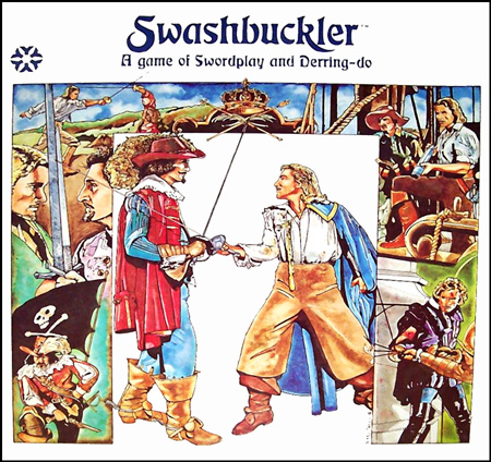
The cover and interior mapboard for Swashbuckler (1980), which simulated shipboard battles and tavern brawls, complete with throwing flagons of ale, swinging from chandeliers, and yanking the rug out from under the opposition.

The breadth of subject matter covered by the Album Games was remarkable, and a good illustration of the flood of new ideas that was changing the face of the boardgaming subculture at the time. Here’s a sample of titles from Yaquinto’s catalog:

MM

MM

MM

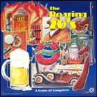
The Roaring 20s pits mobsters against the police commissioner and each other, as they manage speakeasies, rob banks, and put out hits on one another; Adventurer is a science fiction version of Swashbuckler, with small-scale scuffles taking place aboard starships or in planetside cantinas; Apache has the white man bringing civilization to the American West via the railroad, while the indigenous tribes raid and pillage in return. More details of any of these games can be found by clicking on the above thumbnails.

The BoardGameGeek rating system puts most of the Album Games at around 5 on a 10-point scale. I haven’t played one since 1986, but that feels about right, even for the time. The thing that made these games exciting to play wasn’t their rules — it was their themes, and the production values that reinforced those themes. Avalon Hill, SPI, and West End Games were all putting out products at least as diverse, and more playable, but Yaquinto knew how to put together an appealing package.

What the explosion in game themes demonstrated to me then was that boardgames could be about anything. They didn’t have to be dry re-enactments of historical battles simulated in detail, or boring exercises in die rolling like Monopoly. With some imagination and clever abstraction, a game designer could allow players to enter the worlds of Sinbad the Sailor, Sherlock Holmes, or Richard Nixon and John F. Kennedy. The equivalent experience in comics for me was discovering Read Yourself Raw while I was in art school.

I still believe that boardgames can be about anything, in the same way that a comic book can be about anything; it’s just another medium through which to process some part of the world, or one’s imagination. I have notebooks full of ideas, from an adaptation of Pride & Prejudice to a globe-trotting pulp adventure, and one day I hope to see some of them through to fruition. In the mean time, I keep an eye out for games that push the boundaries of theme in new and interesting ways.

City of Smoke in the Wall Street Journal (Online)

May 27, 2008

I don’t know who reads these sorts of online reading lists, but I have to assume that the Wall Street Journal pulls in a fair number of eyeballs. You have to scroll down, click on the “See our summer reading list” link, then the “Historical Fiction” tab and then the title of the book in the left-hand sidebar. Seems kind of buried, but I’m not complaining! I’m really happy that they put it under “historical fiction” and not a “graphic novel” category, and they say some nice things. Bob Hughes, the WSJ books guy, was also refreshingly kind and well-informed on the phone.

The Power of Suggestion [2]

May 22, 2008

Addendum to my previous post about graphics and imagination, perhaps only funny to those among us who are familiar with “roguelike” games. Peruse other installments of Time Stone’s Strafe Left here. The strip appears regularly in PC Gamer UK, and if you don’t get many of the jokes, don’t feel bad — it just means you’ve had better things to do than immerse yourself in video game culture.

CCS Class of 2008

May 20, 2008

Commencement for the Center for Cartoon Studies class of 2008 was held last Saturday in the old opera house in White River Junction, Vermont. We kicked another crop of misbegotten ideogramographers out the door and celebrated afterwards with root beer and mice made out of chocolate mousse. I would be lying if I said I didn’t shed a tear or two during the ceremony. I feel incredibly fortunate to have been able to spend my first year teaching at the college level with this particular gang of artists, whose careers I will follow with much interest in the coming years. Thank you all for the hard work and passion you brought to the drawing table and classroom!

The above image is a great self-group-portrait the students put together as an awesome parting gift to the faculty. Here’s is a key to the characters with links to their comics work: